Friday colour – pink

I have a love-hate relationship with pink. A soft yet striking suits-everyone hue; yet walk down the ‘girl’ aisle in any toy store and it’s enough to put you off pink for life.

Here’s a collection of pink.

Colour-Palette_closeup-11-1 colour_palette_books_02-1Colour-Palette_closeup-12-3Colour-Palette_closeup16-3Colour-Palette_closeup19-3Colour-Palette5_closeup-3colour_palette_books_01-1

Looking for more colour inspiration? Here’s our post on how to choose the perfect colour for your brand. Here’s some ways to work with copper too.

Quirky packaging – picked up at my local Asian deli

Walk into most Asian deli/specialty shops, head to the ‘snack’ section and you will see one thing: Colour. Big, bold, bright colour. Cartoons and characters, crazy type and illustrated contents. And pink. Lots of pink.

A style is clear in the mayhem, directly influenced by its target market. Chips, biscuits, soft drinks, lollies; they’re not traditional products, but they are the special little luxuries for the young. And it’s a bit addictive – all that colour and cutesy.

I spent a long time perusing the aisles of my local specialty shop and I picked these packages because I loved their quirky boldness and (relative) simplicity.

Missed our last post on packaging design? Check out some great typography in packaging here.

Packaged biscuits

packaging_01

For all the clashing colours and multiple imagery going on, this design actually looks fairly clean and simple. All the flat graphics help push the photo of the biscuits out – and compositionally it’s well balanced. What I loved about it was the little food mascots on the back; who knew that radishes moonlight selling carrots, or that penguins were well-versed in the joys of capsicum (red peppers)?!

packaging2_02

Apple drink

packaging_07

This one was a bit different from its brightly shouting counterparts – the colours more subtle, the information pared back. The background graphic of the apples made me think of ye-olde botanical illustrations, which of course was the reason I bought it. Who can resist a beautifully drawn apple?

packaging2_08

Pocky

packaging_09

There were lots of colours to choose from here, including a Barbie-pink strawberry flavour. I love the bold simplicity of this one. On the shelf it really stood out, a big block of colour in amongst multicoloured competition. I also think the product illustration is clever – it’s dynamic and showcases the contents without needing extra styling. It made me think of pick-up-sticks, so it also won nostalgia points.

packaging2_10

Caramel Corn (Strawberries and cream flavour)

packaging_05

I’m not sure what to make of this product – they’re basically strawberry-flavoured sugar-coated chips. A bit like Fruit Loops. But they are more-ish, and if your packaging looks like it is happily chowing down on its own contents then I guess that’s a positive!

packaging2_06

Fruity-Honey Bear lollies

packaging_11

I love the illustration on this one. And it jumped out on the rack. There’s something oddly seemless in the merging of the vector-based bear graphic and the photographed fruit and honey; the texture is well matched and the composition works. And I love a banner element.

packaging2_12

Jasmine Tea

packaging_03

So this one doesn’t really fit with the others, but I loved the tin. The yellow is gorgeous and the simple type means this becomes a great gift item rather than just a pantry restock. The French wording on alternating sides makes it feel a bit special – I wish more packaging took this approach rather that whacking the translated product information underneath.

packaging2_04

Want more design? Have a look at some great book covers here or look at our review of Supergraph! here

Friday colour palette – How to use copper: 7x complementary colour pairs

Raindrops on roses and whiskers on kittens
Bright copper kettles and warm woollen mittens
Brown paper packages tied up with strings
These are a few of my favorite things

Interior trends have been all over copper this last year; exposed copper pipes, dipped copper trinkets, copper paint, copper prints. There is a lovely warmth to copper, and it makes a great base or highlight for a contemporary palette.

Here are some complementary colours for copper.

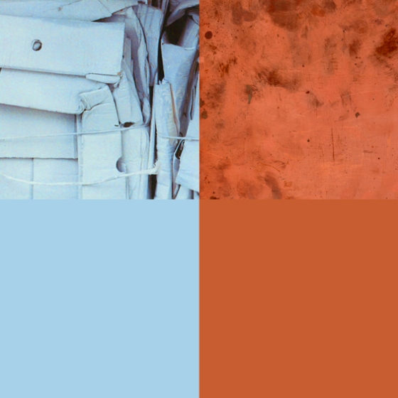
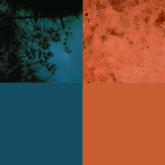
Pale blue + Copper

2-colour-combos-COPPER_01

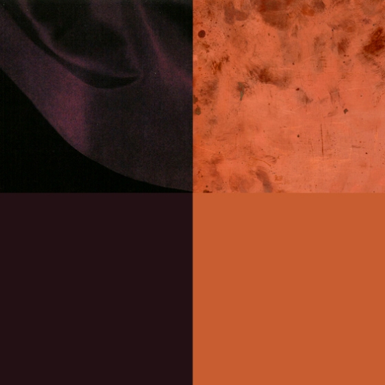
Deep Plum + Copper

2-colour-combos-COPPER_02

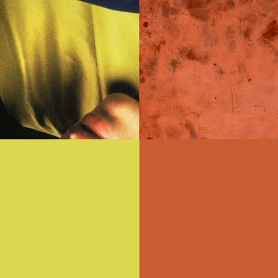
Citrus Yellow + Copper

2-colour-combos-COPPER_03

Soft Grey + Copper

2-colour-combos-COPPER_04

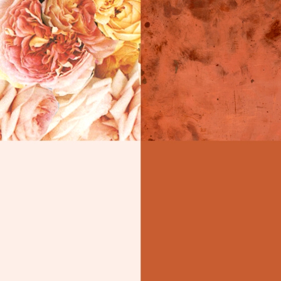
Icy Pink + Copper

2-colour-combos-COPPER_05

Marine Blue + Copper

2-colour-combos-COPPER_06

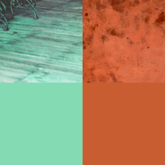
Mint Green + Copper

2-colour-combos-COPPER_07

Want some more colour combos? See 7 complementary pairs for teal here; or more copper here


Friday colour palette – geometrics and pastels

Some geometric play.

colour_palette_26

Deadwood, brown paper packages, salmon of doubt, little boy blue, shades of …

colour_palette_26-3 colour_palette_26-2 colour_palette_26-1colour_palette_26-4colour_palette_26-5

Want some more colour? Here’s some more pastels, and some more geometrics here.

Friday colour palette- inspired by my bookshelf #4

More books. One of my favourite colour combinations- navy and emerald.

colour_palette_books_04

Oxford navy, gunmetal-grey, Eliot blue, emerald city, English sage.

colour_palette_books_04-5 colour_palette_books_04-4 colour_palette_books_04-3 colour_palette_books_04-2 colour_palette_books_04-1

Friday colour palette- inspired by my bookshelf #2

Some more bookshelf colour to brighten up your day.

colour_palette_books_02

Macchiato, pink as pink, faraway red, spring green, creamy sand, dusty teal, silver grey.

colour_palette_books_02-4  colour_palette_books_02-2colour_palette_books_02-3 colour_palette_books_02-1

Want some more colour? Here’s another palette, and another.

Friday colour palette- inspired by my bookshelf

Do you order your bookshelves by colour? This one is for you.

colour_palette_books_01

Dark ocean, swimming blue, fuchsia, burnished gold, yellow days

colour_palette_books_01-4 colour_palette_books_01-3 colour_palette_books_01-2 colour_palette_books_01-1

Want some more books? Here’s my weekend creative styling project