Friday colour – pink

I have a love-hate relationship with pink. A soft yet striking suits-everyone hue; yet walk down the ‘girl’ aisle in any toy store and it’s enough to put you off pink for life.

Here’s a collection of pink.

Colour-Palette_closeup-11-1 colour_palette_books_02-1Colour-Palette_closeup-12-3Colour-Palette_closeup16-3Colour-Palette_closeup19-3Colour-Palette5_closeup-3colour_palette_books_01-1

Looking for more colour inspiration? Here’s our post on how to choose the perfect colour for your brand. Here’s some ways to work with copper too.

Friday colour – four seasons

Melbourne is not a city that sticks strictly to its seasons. It likes to keep us guessing.

It has turned us into a people obsessed with the accuracy of weather forecasts. Fifty-percent of people I know have the weather radar app on their phone and yet are not outdoorsy types. We Melburnians compare notes on the art of layering over a beer. We share umbrellas at traffic lights with sodden souls. We frequently test our city by planning outdoor events without back-up plans; but we will brave any weather providing there is coffee or wine nearby.

Here are some colour palettes from the last few months inspired by the seasons.

Winter

colour_palette_29

Winter clouds, storm coming, blackest night, red velvet armchair, Baileys on ice

Spring

Colour-Palette_v16

Velvet grape, mulled wine, come-get-me pink, dusty rose, grey clearing, electric teal, neon lime

Summer

Colour-Palette_v22

Clouds ahead, Wash away grey, summer girls, peachy glow, copper ground, emerald eyes, tropical foliage

Autumn

Colour-Palette_v28

Pearl blush, French blue, off-teal, pale bronze, spotlight, shiver of emerald, mossy grey, hello mustard.

Looking for more colour inspiration? Here’s our post on how to choose the perfect colour for your brand. Here’s some styling with yellow too.

Friday colour – 5 palettes with pastels

With some sunshine today I’m dreaming of Spring. Here’s some pastel-inspired palettes for our Friday colour.

colour_palette_pastels_03

Minty blue, foggy lake, dusty pink, milk chocolate ganache, purple dusk.

colour_palette_pastels_04

Kitten grey, steely blue, copper, rose pink, buttermilk.

colour_palette_pastels_02

Deep turquoise, lavender, cold grey, mushroom, sage.

colour_palette_pastels_05

Faded silk, light copper, gold, spun straw, grey blue.

colour_palette_pastels_01

Minty grey, gold wash, forest green, black, iced pink.

Looking for more colour inspiration? Here’s our post on how to choose the perfect colour for your brand. Here’s some styling with yellow too.

How to use red: 10 unique colour palettes

I’m seeing red today. Here’s ten colour palettes using fire-engine red as your base.

Teal + Taupe + Red

2-colour-combos-RED_01

Glass lake + Marine blue + Red

2-colour-combos-RED_17

Dusty blue + Sage + Red

2-colour-combos-RED_16

Royal purple + Coral + Red

2-colour-combos-RED_14

Ivory + Milky tea + Red

2-colour-combos-RED_12

Navy + Yellow chartreuse + Red

2-colour-combos-RED_08

Pale gold + Yellow rose + Red

2-colour-combos-RED_06

Seafoam + Purple grey + Red

2-colour-combos-RED_05

Very pink + Cherry + Red

2-colour-combos-RED_03

Cream + Olive gold + Red

2-colour-combos-RED_02

Using red? Check out our post on fifty shades of red.

Friday colour palette – How to use copper: 7x complementary colour pairs

Raindrops on roses and whiskers on kittens
Bright copper kettles and warm woollen mittens
Brown paper packages tied up with strings
These are a few of my favorite things

Interior trends have been all over copper this last year; exposed copper pipes, dipped copper trinkets, copper paint, copper prints. There is a lovely warmth to copper, and it makes a great base or highlight for a contemporary palette.

Here are some complementary colours for copper.

Pale blue + Copper

2-colour-combos-COPPER_01

Deep Plum + Copper

2-colour-combos-COPPER_02

Citrus Yellow + Copper

2-colour-combos-COPPER_03

Soft Grey + Copper

2-colour-combos-COPPER_04

Icy Pink + Copper

2-colour-combos-COPPER_05

Marine Blue + Copper

2-colour-combos-COPPER_06

Mint Green + Copper

2-colour-combos-COPPER_07

Want some more colour combos? See 7 complementary pairs for teal here; or more copper here


Friday colour palette – How to use teal: 7 colour pairs that work

Teal is a deceptively flexible colour. Yes, it’s a fence-sitter. It can’t decide whether it’s blue or green – but somehow this works to its advantage when pairing it with others. Whatever you pair it with though, there’s no denying it a part of the spotlight. Teal is a colour to be looked at and envied, as Tiffany’s shows us so well.

So here’s some pairs for teal. Colours that hold their own next to some strong competition.
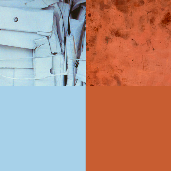
2-colour-combos-TEAL_07

Red + Teal

I love this combo. It’s a bit retro. I’ve seen these colours used in lots of kids products, party decorations and clothing – it’s a great gender-neutral palette that’s fun and bright.

2-colour-combos-TEAL_02

Navy + Teal

Safer, but very pleasing. It makes a flighty teal more serious, more appropriate for a corporate scene. Navy goes with just about anything, but it is a little bit more lovely with teal by its side.

2-colour-combos-TEAL_01

Brown + Teal

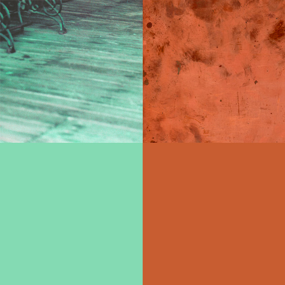
Brown and teal are pretty classic – and there are many shades of brown that work with teal. I like the contrast of warm/cool and the brown edging towards khaki.

2-colour-combos-TEAL_04

Green + Teal

In my eyes, for this combination to work well it’s best to let one colour dominate over the other. It could go either way, but I prefer teal staying the hero with accents of green.
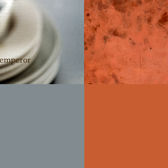
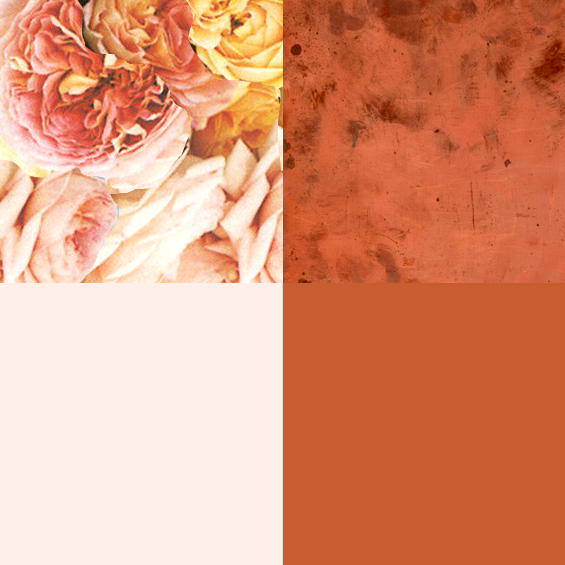
2-colour-combos-TEAL_06

Neutral + Teal

Neutrals by definition should go with just about everything. I find teal and white together (though also a classic combination) are hard to pull off well – I prefer using an off-white, bone, pale mushroom or sand, it gives your palette more depth.

2-colour-combos-TEAL_05

Grass/lime green + Teal

Using green with teal pushes it over the blue fence, which is a relief for the indecisive among us. Yellow-greens generally work well with teal, but beware the execution. The wrong shade (or the wrong percentages) can look clashing.
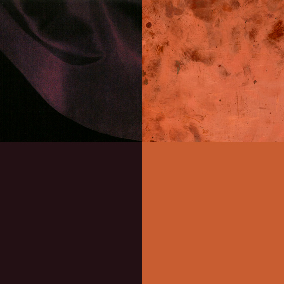
2-colour-combos-TEAL_03

Purple + Teal

These two were born to be together. Look at them. They’ll have beautiful children.

Like some more teal? Here’s another teal palette, and another one here.