Friday colour palette – How to use copper: 7x complementary colour pairs

Raindrops on roses and whiskers on kittens
Bright copper kettles and warm woollen mittens
Brown paper packages tied up with strings
These are a few of my favorite things

Interior trends have been all over copper this last year; exposed copper pipes, dipped copper trinkets, copper paint, copper prints. There is a lovely warmth to copper, and it makes a great base or highlight for a contemporary palette.

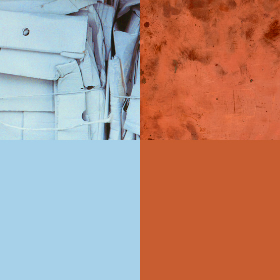
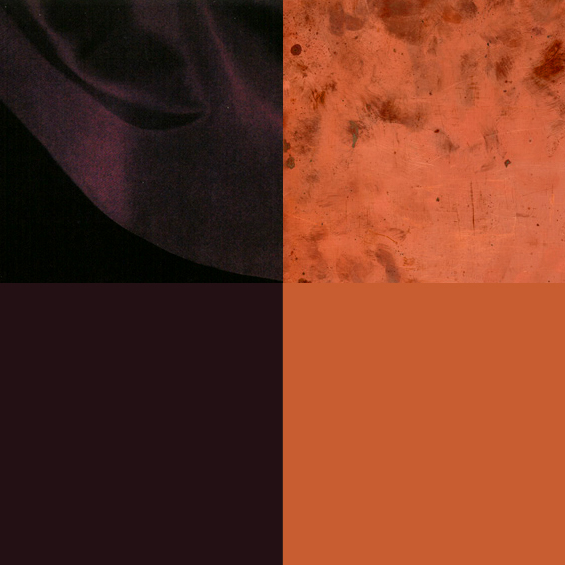
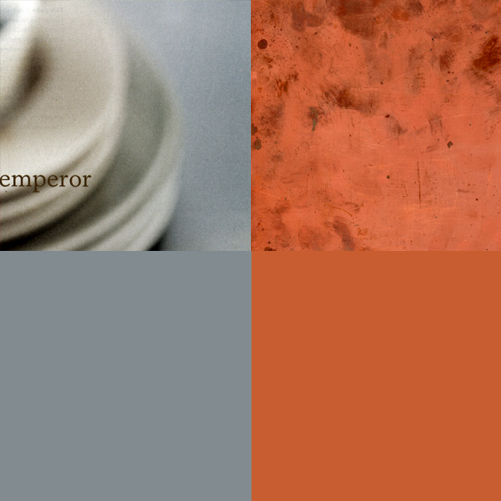
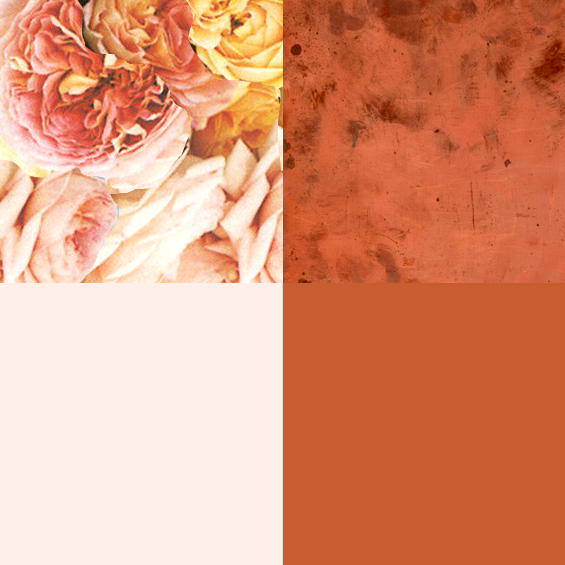
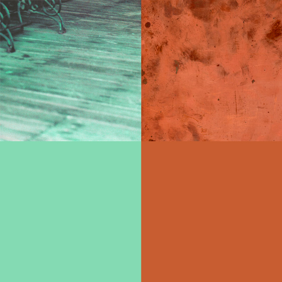
Here are some complementary colours for copper.

Pale blue + Copper

2-colour-combos-COPPER_01

Deep Plum + Copper

2-colour-combos-COPPER_02

Citrus Yellow + Copper

2-colour-combos-COPPER_03

Soft Grey + Copper

2-colour-combos-COPPER_04

Icy Pink + Copper

2-colour-combos-COPPER_05

Marine Blue + Copper

2-colour-combos-COPPER_06

Mint Green + Copper

2-colour-combos-COPPER_07

Want some more colour combos? See 7 complementary pairs for teal here; or more copper here


Friday colour palette – collaged gemstone

This is an example of my random collage (otherwise known as the reason I give for hoarding pamphlets and destroying secondhand books). I’ve done a few of these now, for no other reason than for the simple pleasure of using scissors and glue. I do like how the colours have come together in this one.

colour_palette_gem

Emerald, sapphire, blue topaz, green chalcedony, pale amethyst, copper, slate.

colour_palette_gem01-3 colour_palette_gem01-2colour_palette_gem01-4 colour_palette_gem01-1

Looking for more collage? Here’s Gatsby girl and Cinderella.